Edited: This post was written few days after the release of Adobe Lightroom 4 Beta 1. Few days ago, the final release of Lightroom 4 has been shipped and, as expected, the new development process has suffered no changes.
A few days ago Adobe released the
first beta preview of the upcoming release of Adobe Photoshop Lightroom 4. This
Beta release introduces many new features and a new development process (2012).
The new development process is at least as intuitive as its predecessor, although it's been fundamentally redesigned. At first, it may seem pretty different, especially when you compare the result you obtain applying the "same" adjustment in the previous process (2010) and in the new one.
In fact, despite the need of getting used to the new tool, I believe that the new process is both more intuitive and more powerful.
Neutral Defaults
The first thing you'll notice when importing a photo into Lightroom 4 is that default settings are more
neutral. Lightroom 3 defaults introduce a bit of contrast in two places:
- The Blacks slider is set to 5, shifting down the black point a bit.
- The tone curve is set to Medium Contrast.
While it's true that we're very often pushing the contrast a bit, I don't like Lightroom doing it for me during the import phase. In fact, I usually reset those settings either manually or with a preset just while importing. Lightroom 4, on the other hand, just lets your image untouched: the only setting that's still applied is the
Adobe Standard profile in the
Camera Calibration panel.
Although it may seem a minor problem, it also has a serious impact on the effect of other controls, such as the Exposure control, on Lightroom 3. This problem is not only evident on low key images, or images with dark shadows, but also on images whose exposure you need to increase more than a bit. Why? Because
Blacks is used to set the black clipping point. When it's set, Lightroom will try to preserve it: if you shift rights or expand the histogram more than a bit, results may start to look unnatural.
Look at this image:
 |
| Underexposed Image |
When I shot it, I voluntarily underexposed it: I had no tripod, the camera ISO was already set to maximum, but the shutter speed was too slow. After import Lightroom defaults were applied. Let's see what happens if I unnaturally raise the exposure:
 |
| Overexposed Image - Blacks: 5 |
As you can see, the results doesn't mimic an on-camera overexposure. Darks and shadows are simply too dark. Part of this problem is how the
Exposure control works in Lightroom 3 (it's significantly improved in Lightroom 4), but part of it is also the default
Blacks settings. If you just set it to 0, here's the result:
 |
| Overexposed Image - Blacks: 0 |
The result is certainly more similar to what you'd expect. Keep in mind that this seriously underexposed image is used as an example, but you may experience similar problems with any sort of image with strong shadows, such as portraits of dark haired people or high contrast images such as the following:
 |
| High Contrast Image |
I shoot RAW because I want to have full control and good working margins in post production. You'd better get used starting with neutral defaults rather than using a default contrast level, although moderate, introduced by Lightroom. In many cases, the default black clipping point is simply too much.
Development Process
As we've seen, Lightroom 4 uses more neutral defaults which, in my opinion, are a better starting point when you develop your images. Furthermore, the Lightroom 4 development process has been redesigned and, as a result, the control you've got on the tones of the image has been vastly improved.
Here's the Basic panel in Lightroom 3, showing the tools available in the 2010 development process whose functionality has been detailed in my
Lightroom Tutorial:
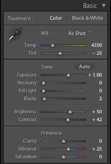 |
| Lightroom 3 - Basic Panel |
On the other hand, here's the new Lightroom 4
Basic panel:
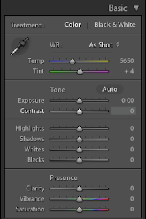 |
| Lightroom 4 - Basic Panel |
As you can see, in Lightroom 3, the tonal range is divided into 4 segments (
Exposure,
Recovery,
Fill Lights and
Blacks), while in Lightroom 4 it's divided into 5 (
Exposure,
Highlights,
Shadows,
Whites,
Blacks). The differences, however, are much deeper and the way those sliders work has changed substantially.
Exposure
In Lightroom 3, the
Exposure slider was used to control the overall exposure of the image but it had a major drawback: it ungracefully clipped the highlights. Here's what happens when raising the Exposure to +4 to the previous image:
 |
| Lightroom 3 - Exposure: +4 |
As you can see, highlights are completely blown up.
This is why a
Brightness adjustment was available in Lightroom 3.
Brightness modifies the exposure on the middle tones, without shifting (at least too much) the black and the white point. In Lightroom 3, tweaking the exposure could be tricky:
- You would use the Exposure adjustment to set the overall exposure level, paying attention not to clip the whites too much.
- You would use the Recovery adjustment to recover blown up details, if necessary.
- You would use the Brightness slider to fix the exposure without affecting the white point.
Not difficult but time consuming. Also, images with strong highlights were even trickier to fix:
- You cannot push Exposure too much, because you would clip the whites.
- You could use Brightness, but it isn't effective on the shadows.
- You could use Fill Lights to correct the exposure on the shadows, but large adjustments would shift up all of the histogram too, making it difficult to keep overall exposure under control.
In either case, the overall tones of the image would suffer, and you could end up with unnatural feelings or artificial-looking low contrast images. In my opinion, all the problems originate in how the basic tone adjustments end up affecting all of the histogram (with notable exception, such as
Recovery).
Lightroom 4 has greatly improved these controls and now fixing the tones of your images is easier then ever. As you've surely noticed, the
Brightness adjustment has disappeared. Indeed, the
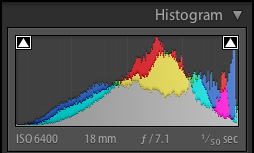
Exposure adjustment behaviour has changed dramatically: it now affects the middle tones with much less effect on blacks and whites. On the following image you can see which part of the histogram is mainly affected by the Exposure adjustment:
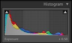 |
| Lightroom 4 - Exposure |
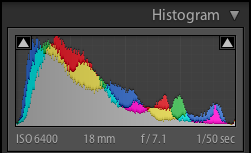
In fact, it falls off much more gracefully on either end of the histogram, mimicking the graceful degradation of film, rather than the abrupt clippings we experience with digital sensors. Here's the same image with a similar (excessive)
Exposure adjustment:
 |
| Lightroom 4 - Exposure: +4 |
Much better. This way, applying an overall exposure adjustment as a starting point is much easier than before.
In this case, for example, a +.50 adjustment is a perfect starting point to develop this image, without worrying about blacks (yet):
 |
| Lightroom 4 - Exposure: +.50 |
Highlights and Shadows
As we've seen in the previous section, the
Exposure adjustment now mainly affects middle tones, the central section of the histogram. In Lightroom 3,
Exposure also affected a higher part of the histogram: this part is now more finely controlled by the
Highlights adjustment:
 |
| Lightroom 4 - Highlights |
Pretty much symmetrically, Lightroom 4 introduced another adjustment, called
Shadows, to control the lower tones of the histogram:
 |
| Lightroom 4 - Shadows |
You may think that
Shadows is the equivalent of the legacy
Fill Lights. It certainly is, if you only consider the tones it controls. But this is not only a mere name change, though. As we've seen with
Exposure, in Lightroom 4 each tone adjustment affects contiguous tones
to a lesser extent. This is very important, as you can now adjust different tones without a great impact on the all image.
Let's see what happens in Lightroom 3 if you raise the
Fill Lights adjustment:
 |
| Lightroom 3 - Fill Lights: +80 |
Once more, this is an example meant to understand Lightroom's behaviour. Nonetheless, that's what happens if you push shadows too high in Lightroom 3. To tweak them correctly, you sometimes have to rely on local adjustments (with a brush) or, if possible, a careful and time-consuming adjustment of the entire tone curve. In fact, Fill Lights shifts the
entire histogram up and down:
 |
| Lightroom 3 - Fill Lights: +80 |
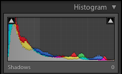
Lightroom 4, on the other hand, applies a much more limited adjustment:
 |
| Lightroom 4 - Shadows: +100 |
The result is much more natural and, above all,
predictable. Look at the resulting histogram, you can see how Shadows, although pushed up to the maximum value, has modified the histogram
locally:
 |
| Lightroom 4 - Shadows: +100 |
As we go discovering the tone controls, we see that it's easier to get to the result we've got in mind using Lightroom 4 rather than Lightroom 3. In this case, I think an adjustment of
Shadows +42 is what I'm looking for:
 |
| Lightroom 4 - Shadows: +42 |
Whites and Blacks
The last two tones adjustments, certainly not surprisingly, affects the lower and higher ends of the histogram and are basically used to set the white and the black point. Lightroom 3 only had an adjustment to set the black point (
Blacks) and you had to set the white point using other controls (usually
Exposure or a combination of
Exposure and
Recovery).
Lightroom 4 makes life easier (once more), and provide two separate controls to set your image clipping points:
Whites and
Blacks. In this case, once again, this controls affect a
limited range of tones in the histogram and won't have a great impact on the overall tone range. As a result, these adjustment are more predictable and easier to use.
The behaviour of the
Blacks adjustment in Lightroom 3, as you can see, was greater and spanned the overall histogram, even for moderate values:
 |
| Lightroom 3 - Blacks: +50 |
Please note how the histogram has been shifted down entirely:
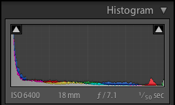 |
| Lightroom 3 - Blacks: +50 |
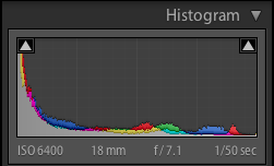
In Lightroom 4, on the other hand, the Blacks adjustment has a more limited and more local effect, even at maximum value:
 |
| Lightroom 4 - Blacks: +100 |
Look at the brightest parts of the image, such as the reflections on the water or the sky. That's the effect of
not shifting down the entire histogram so much as Lightroom 3 did:
 |
| Lightroom 4 - Blacks: +100 |
The same thing happens with the
Whites:
 |
| Lightroom 4 - Whites: +50 |
 |
| Lightroom 4 - Whites: +50 |
Adjusting the brightest parts of the image (the reflection of the lights) to make them brighter is very easy, without modifying the other tones. In Lightroom 3, this wasn't possible unless modifying the
Exposure (and thus, the entire histogram), or modifying the tone curve.
Clarity
The
Clarity adjustment has undergone a serious revision in Lightroom 4. It's now much more powerful and you can estimate using half the value you were using in Lightroom 3 to get pretty much the same effect.
Clarity is used to modify local contrast. This adjustment is very handy and potentially save many roundtrips from Lightroom to Photoshop during your workflow. However, I think that positive
Clarity in Lightroom 3 had too much a weak effect in certain circumstances and I had to edit the image in Photoshop. Moreover, halos would appear very soon raising Clarity, and that's another issue that makes me open Photoshop more often than I'd like.
Both issue have been solved and Clarity works much better than ever in Lightroom 4.
This is an extreme example, but here's the result of applying maximum
Clarity in both Lightroom 3 and 4:
 |
| Lightroom 3 - Clarity: +100 |
 |
| Lightroom 4 - Clarity: +100 |
It's too much for that image, I agree. But if you consider that you can locally brush in
Clarity, this should give you an idea of the flexibility you can get from this improved adjustment.
Conclusion
So much for this post. We've seen how the new development process in Lightroom 4 is easier to grasp, easier to use and more predictable. Sure, we've got to "forget" about the old one and learn a new one from scratch. However, I think that the improvements are really worth this effort and I'm convinced that your effectiveness will improve dramatically.
Although out of scope in this post, here are other interesting new features and improvements that we will likely see in the
upcoming Lightroom 4:
- New Map module to manage geolocation data.
- New Book module to make photo books.
- New and improved local adjustment such as: Temperature and Tint and Noise reduction.
If you haven't done it yet, go to Adobe Labs, download and test drive Lightroom 4. I'm sure you'll be positively surprised.
If you want to help me keep on writing this blog, buy your Adobe Photoshop licenses at the best price on Amazon using the links below.


